Simulating the Sun with Flash
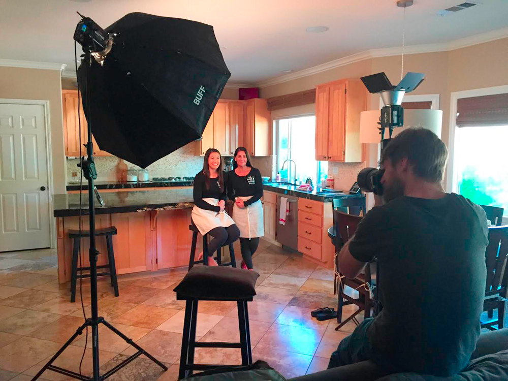
When I learned this simple trick for simulating the look of "golden hour" sunlight with flash, my life as a photographer changed for the better. Suddenly those overcast days were just an extended golden hour, providing the benefit of soft front light with the always-welcome golden back light. I'll give you the simple breakdown so you can start using this to get that sunny look when weather doesn't cooperate. All of the images were made on an overcast day with…